Team
CEO
Business Development
CTO
Technical implementation
CMO
Marketing
CDO (me)
UX/UI Design, Product Strategy, MVP Definition, Interaction Design
Overview
The Problem
MyTurn had a scientifically backed parenting method, but no product parents could use daily.
My Approach
Define the MVP, create an emotionally supportive UX and UI
The Insight
Parents needed quick, guided, rewarding micro-actions.
The Insight:
Validate real market demand and launch an MVP parents would trust and return to.
Research,
Idea and Market Need Validation
To ensure the app met the needs of both parents and children, we set 2 distinct research objectives.
01
UX Challenge:
Understand how parents navigate task management and motivation systems.
Method: in-depth interviews with parents, with children and with child psychologists.
02
Technical Challenge:
Investigate how children interact with task-based approach and game mechanics.
These insights directly informed the app’s structure, ensuring that both parent and child journeys were built around clarity, motivation, and emotional safety.
Key Insights are:
(01)
Parents want actionable guidance, not theory.
(02)
Parents want to track progress, not just tasks.
(03)
App must feel safe, supportive, and non-judgmental.
(04)
App must feel like a game to children, not a chore.
Research,
Idea and Market Need Validation
The app’s IA was built around two distinct user flows—one for parents and one for children—ensuring both audiences had fully tailored experiences.

Parents side
task assignment;
reward tracking,;
oversight;
long-term progress.

Children side
Completing tasks;
earning rewards;
celebrating wins.
This dual-flow structure made navigation intuitive while reinforcing the app’s broader goal: empowering parents while promoting independence in children.
Wireframing & Iteration
Iteration 1: Content-heavy layouts overwhelmed parents → simplified and reorganized.

The wireframing phase involved multiple iterations, tested with both parents and children, to ensure the app met their needs.
(01)
Refocused Parent Homepage:
Quick snapshot of each child’s progress with clear status indicators and summaries that minimize extra clicks.
(02)
Streamlined Navigation:
Quick snapshot of each child’s progress with clear status indicators and summaries that minimize extra clicks.
(03)
Improved Child Profile:
Added analytics in list + calendar views, with red/yellow/green indicators (<30%, <70%, >70%) for instant clarity.
Iteration 2: The children’s navigation was too complex → reduced steps and removed unnecessary screens.
User testing showed that the early version contained too much information. Children were distracted by secondary elements and struggled to locate what they needed.

The updated design became intuitive, friendly, and focused—helping children stay on track and motivated.
(01)
Reduced information overload and kept only essential UI elements.
(02)
Removed “News” notifications - kids ignored them
(03)
Removed the “Me” page, it didn’t add value or engagement.
Design Transformation & Brand Leadership (UI)
01
Parent/Admin Control Panel (Management & Oversight)
The MyTurn app is built on a clear dual architecture: a powerful Parent Control Panel for management and a highly Gamified Child Interface for motivation.
Designed to minimize administrative friction and maximize clarity.
(01)
Granular Task Configuration
Critical for appealing to Compliance Managers and C-level buyers.
What?
Define Task Type, Points, and Reward Tier (Bronze/Silver/Gold).
Why?
Rewards match the child’s effort and support long-term motivation.

(02)
Family Hub & Secure Delegation
Critical for appealing to Compliance Managers and C-level buyers.
What?
Define Task Type, Points, and Reward Tier (Bronze/Silver/Gold).
Why?
Rewards match the child’s effort and support long-term motivation.

(03)
Dual Progress Visualization
What?
Mini Calendar (quick view) + Full Calendar (historical trends).
Why?
Supports both lightweight and in-depth oversight.

02
Child Interface (Engagement & Motivation)
A visual, simplified experience engineered for positive reinforcement.
(01)
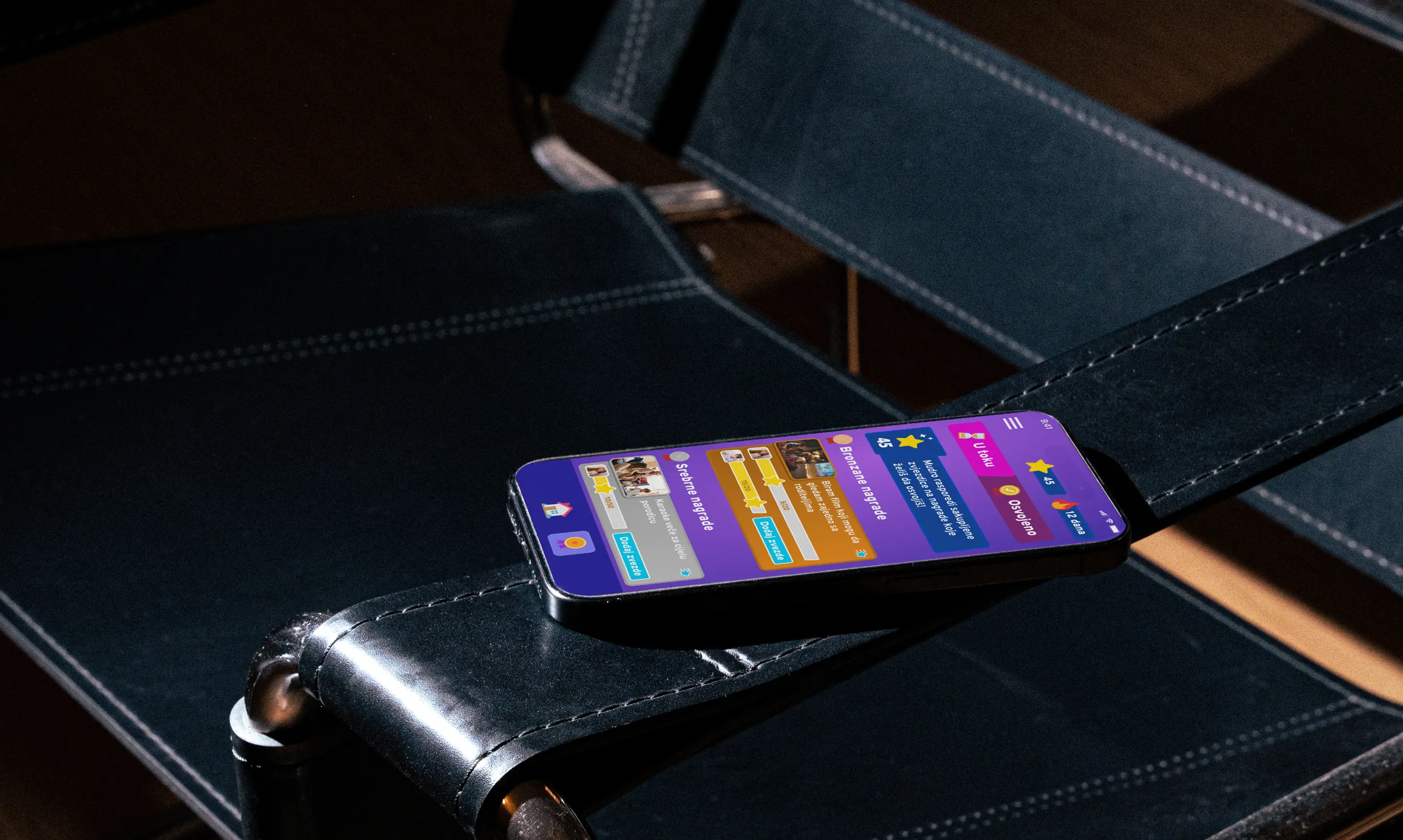
Tiered Goals System
What?
Bronze = quick wins
Silver = mid-term achievements
Gold = long-term motivation
Why?
Rewards match the child’s effort and support long-term motivation.

(02)
Simplified Home Screen & Navigation
What?
The child sees their photo + point balance immediately
Why?
Reinforcing progress before anything else.

(03)
Clear Task Submission Flow
What?
A dedicated confirmation screen
Why?
gives children a sense of ownership and creates a consistent approval queue for parents.

Website design & development
The website is our primary tool for education and conversion, designed to quickly connect with parents and drive measurable growth.
A Foundation Built for Speed
To maximize our velocity, we built the entire site using Tilda with modular sections. This strategic speed-to-market decision empowered our non-technical team to continuously iterate on copy and features.
This approach was crucial in achieving a Velocity gain that reduced our time-to-publish by 14 days, allowing us to maximize pre-launch testing and stay agile.
Connecting with the Regional Audience
We eliminated language barriers by implementing Multilingual Support (EN / SR / ME) and localized routing. This regional relevance ensured that parents immediately felt trust and connection. Our goal is to see a tangible Conversion lift, specifically targeting a [+Y%] increase in Click-Through Rate (CTR) on the primary sign-up button from non-English speaking traffic.


Outcomes
+2000 active users
Users moved from ‘search-and-leave’ behavior to multi-domain comparison within one session
Teacher Approved on Google Play
Define the MVP, create an emotionally supportive UX and UI
+76 countries
The project repositioned Domain.ME from a functional registry into a discovery-led brand platform, aligning its UX with the emotional value of digital identity.
Strategic impact
Validate real market demand and launch an MVP parents would trust and return to.